Hammering Out a Logo
As part of my fascination with brands I’ve always been intrigued by logos and wordmarks. To clarify, a logo is the design or graphic a company uses to express itself. The infamous and brilliant Nike swoosh, for example.
A wordmark is essentially a logo as well, but it’s a stylized text-only treatment of the name (i.e. the actual word ‘Nike’). Sometimes organizations use both a logo and a wordmark (again, let Nike be the example), other times they identify simple with one or the other.
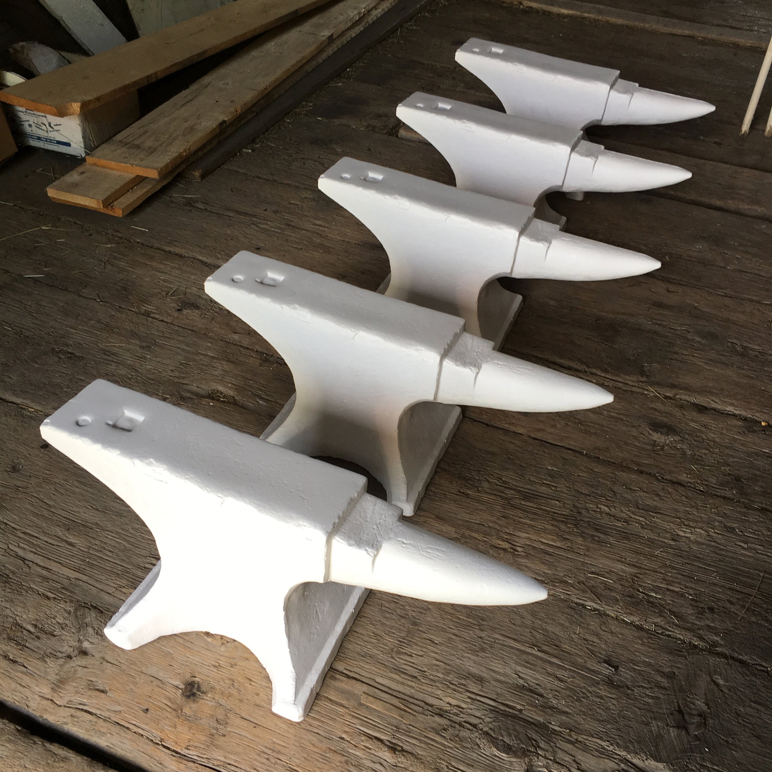
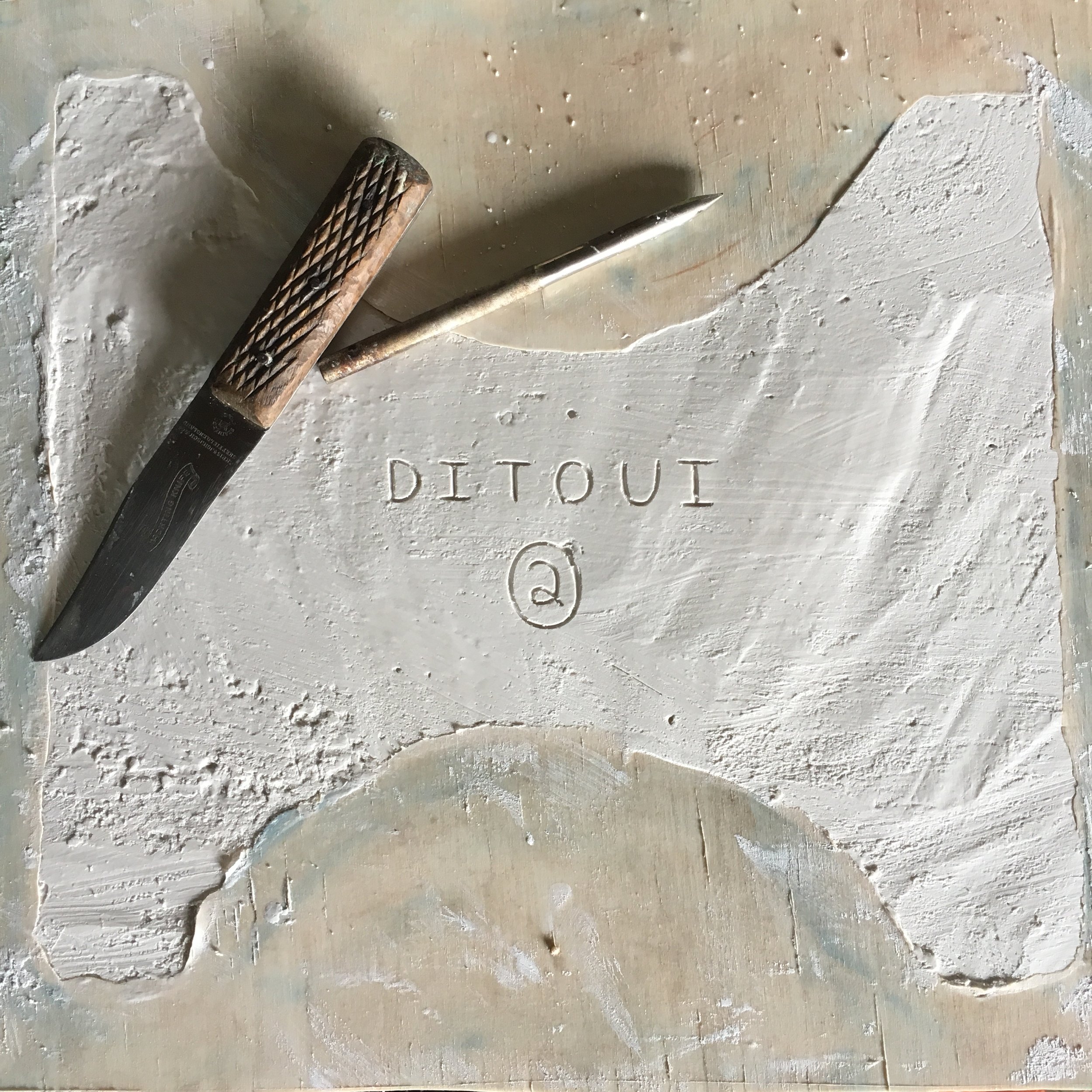
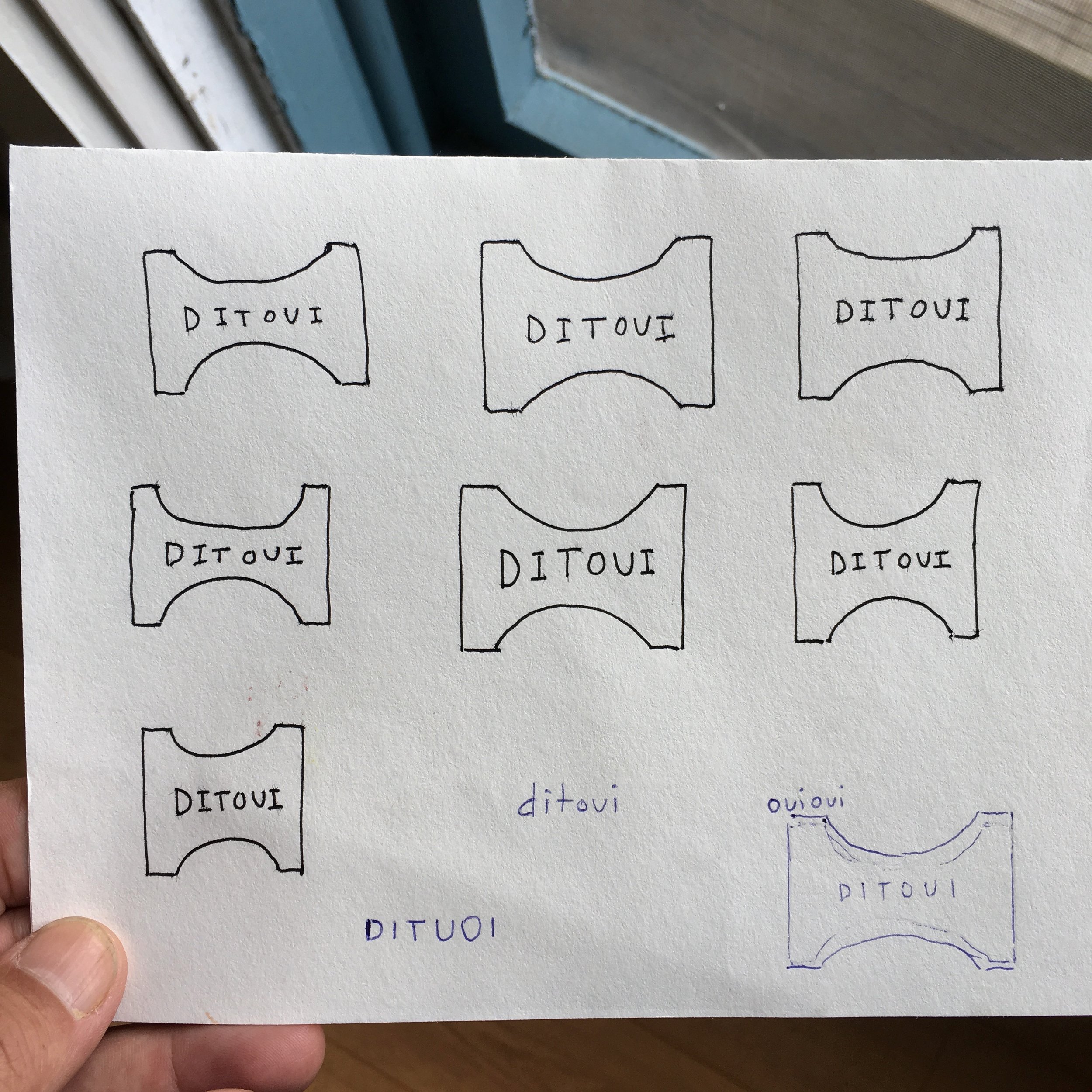
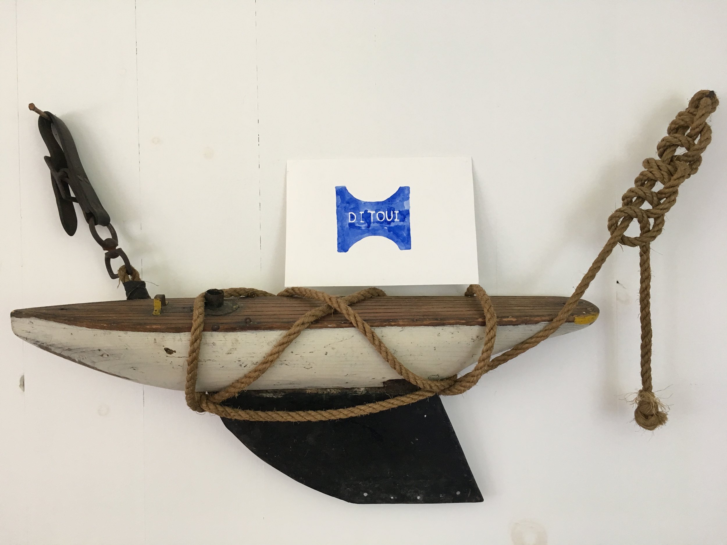
When I started Ditoui I was planning to have only a wordmark, something very basic and vaguely modern. But then inspiration struck. I was making a plaster of Paris copy of a hundred and thirty year old blacksmith anvil (that’s another story) and while carving my name in the base I notice what a wonderfully shaped bottom it had. A pleasing blend of circle and square (the two shapes by which I think you can categorize a person’s way of thinking), a hint of gentle tension and compression, and an abstract suggestion of opposites (a smile and a frown) happily co-existing.
Poetic interpretation aside, what I liked most was the notion that the Ditoui logo would be forever related to the anvil, a rudimentary but spectacularly adaptable tool for creating things. The act and art of hammering away at ideas is an important one. We need to be patient, open to serendipity, and allowing of the final result to be something quite different from what we originally expected. When we trust in the creative process it usually works out.

